Case study · 2018 – 2020
Deloitte — applying a user-centered approach across four industries.
Two years moving between supply chain, retail banking, telecom, and CRM. The work was rarely 'make a screen prettier.'
- Period
- Apr 2018 – Feb 2020
- Role
- UX Consultant → Assistant Manager UX
- Tags
- Service designEnterpriseSalesforceBankingSupply Chain
I joined Deloitte Design Studio in Bangalore in 2018 as a UX Consultant in Technology Consulting, then moved to Assistant Manager in mid-2019. Over two years I worked on engagements with Unilever, FAB (First Abu Dhabi Bank), Vodafone, CEAT, and Deloitte Digital itself — moving between supply chain, retail banking, telecom, and CRM as the work changed.
The work was rarely "make a screen prettier." It was usually: sit with stakeholders, figure out what the product should actually do, then design the version that lets the team build something true to that. Consulting time is short, so the UX process has to be honest — research that informs decisions, IA that survives delivery, design that can be argued for in a room full of people with different agendas.
Most artifacts are under client NDA. Sanitized versions are linked from each project; reach out for full case studies.
Role
- 01UX work across multi-month client engagements — Unilever, FAB, Vodafone, CEAT, Deloitte Digital — moving between industries as the engagements changed.
- 02Running requirement workshops with mixed stakeholder groups (executive sponsors, business owners, end users) and turning competing asks into one shared direction.
- 03Qualitative contextual inquiry, behavioural personas, mental models, journey maps, and multi-channel information architecture — used to set the brief before a screen got drawn.
- 04Partnering with visual designers to evolve per-product pattern libraries handed to clients at the end of the engagement.
- 05Helping with the studio's design hiring — reviewing portfolios, sitting in on interviews.
Designing for e-commerce across omnichannel customer journeys has taught me to solve for complex systems outside just the digital space.
Selected projects
Four projects across four industries — supply chain, automotive, banking, retail. The thing that links them isn't the screens. It's the same UX move: clients arrive with what feels like a software problem, and most of the time the real problem is how the people around the software work together.
01
Unilever Buyers Console
A PowerBI-backed KPI tool for supply-chain buyers, built around the decisions they actually make.
Unilever Buyers Console
A PowerBI-backed KPI tool for supply-chain buyers, built around the decisions they actually make.
Context
Unilever's buyers were sitting on a wall of dashboards, but the dashboards weren't laid out around their decisions — they were laid out around the database. Buyers were exporting to Excel and rebuilding the same views every week.
UX angle
The dashboards weren't broken; they just weren't designed around the buyer's job. They were designed around the data model. That's the difference between an analytics tool that gets used and one that gets exported to Excel.
Approach
Spent time with actual buyers before drawing anything. Re-architected the IA around their weekly cadence — what to negotiate, what to expedite, what to defer. Cleaner visual language, fewer screens, the decision surfaced first.
What I learned
For analytics tools, the IA is the design. Visual polish on a wrong-shape information architecture is wasted work.
02
CEAT Salesforce
Redesigning the Salesforce app Territory Leads use to balance tyre supply and demand across western India.
CEAT Salesforce
Redesigning the Salesforce app Territory Leads use to balance tyre supply and demand across western India.
Context
Territory Leads were using a stock Salesforce build to track tyre demand, dealer orders, and stock-outs across western India. The fields were generic; the work wasn't. Reps were keeping their real worksheet on paper.
UX angle
Customising a platform like Salesforce isn't a clean-sheet UX exercise — most of the work is finding the few places where a small change has outsized effect, then designing those well within the platform's constraints.
Approach
Discovery with Territory Leads and Regional Sales Managers first — what does their day actually look like, where does the platform fail them. Re-modelled the screens around the rep's day: territory snapshot first, supply-vs-demand second, action queues third. Picked the customisation levers that mattered most and let the rest stay default.
What I learned
Even fixed platforms have UX latitude — but only if you know where to look. The skill is choosing the few changes that earn their cost.
03
FAB · Letter of Credit
Digitalising a paper-based Letter of Credit flow for First Abu Dhabi Bank, end to end.
FAB · Letter of Credit
Digitalising a paper-based Letter of Credit flow for First Abu Dhabi Bank, end to end.
Context
Letter of Credit is one of the most stakeholder-heavy flows in trade banking — applicant, beneficiary, issuing bank, advising bank, all working off paper that travels physically between parties. FAB wanted the whole thing digital without losing the audit trail every party needed.
UX angle
In a multi-party flow, the journey map isn't a research artifact — it's the design tool. Each party's screen is a slice of one shared system, and any decision that doesn't hold for all four parties isn't really a decision yet.
Approach
Built one shared journey map across all parties before drawing a single screen. Designed each role's view as a slice of that shared system — same data, different lens. Treated the audit trail as a UI primitive, not a buried log.
What I learned
In stakeholder-heavy systems, the journey map earns more design decisions than the wireframes do. Spending the extra week on the map saves the extra month on revisions.
04Unilever Supply Chain E2E
A cohesive KPI dashboard tying together internal Unilever supply-chain products.
Unilever Supply Chain E2E
A cohesive KPI dashboard tying together internal Unilever supply-chain products.
Context
Internal Unilever supply-chain teams were running multiple specialised tools (Buyers, Portfolio, E2E) — each useful, none speaking to the others. Leadership wanted one window on the whole chain.
UX angle
Three useful tools can still add up to a confusing experience if they don't share a language. The interesting UX problem here wasn't another dashboard — it was the connective tissue.
Approach
Established a shared KPI grammar across the three tools first. Designed the E2E view as a navigable layer on top — drill down anywhere and land in the underlying tool, in context. Avoided rebuilding what already worked.
What I learned
Consistency at the language layer compounds across products. Most "we need a unified dashboard" requests are really "we need to agree on what these words mean."
What two years of consulting taught me about UX
- LESSON 01
The brief is a hypothesis, not a contract.
Clients hire designers for an outcome, not the spec they wrote in the SOW. The first job is reframing the brief before the first sketch — and it's the most expensive thing to skip.
- LESSON 02
The workshop is a design tool.
Stakeholder workshops, done well, do more architectural work than weeks of solo wireframing. A lot of 'alignment problems' are facilitation problems in disguise.
- LESSON 03
Patterns travel across industries.
A pattern that works for territory leads in one industry often works for buyers in another. Domain depth matters; cross-domain transfer matters more.
- LESSON 04
The clock changes the craft.
Consulting forces UX decisions on imperfect data. The instinct it builds — knowing when more research is rigour vs. avoidance — is one of the most useful things I picked up.
Read more here.
Moments
Two years across four industries — team moments and client workshops from the Deloitte Design Studio years.
Team moment from Deloitte Design Studio. 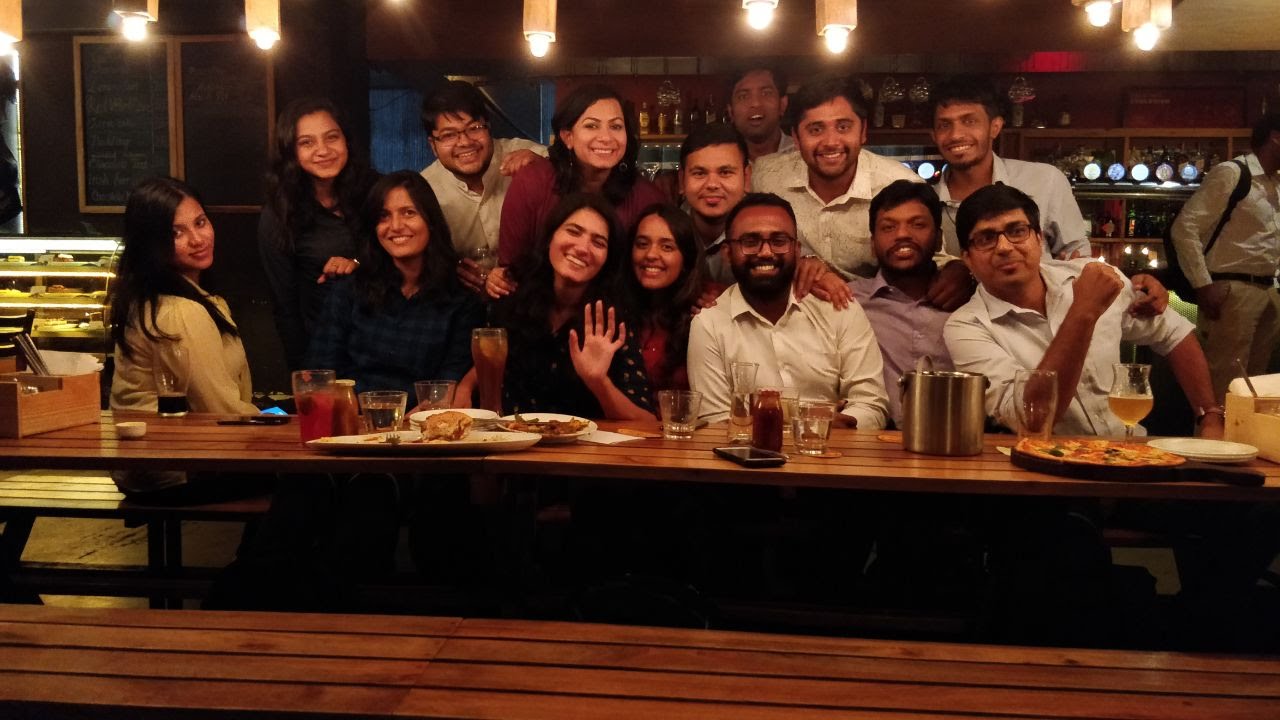
Office celebration and cross-team collaboration. 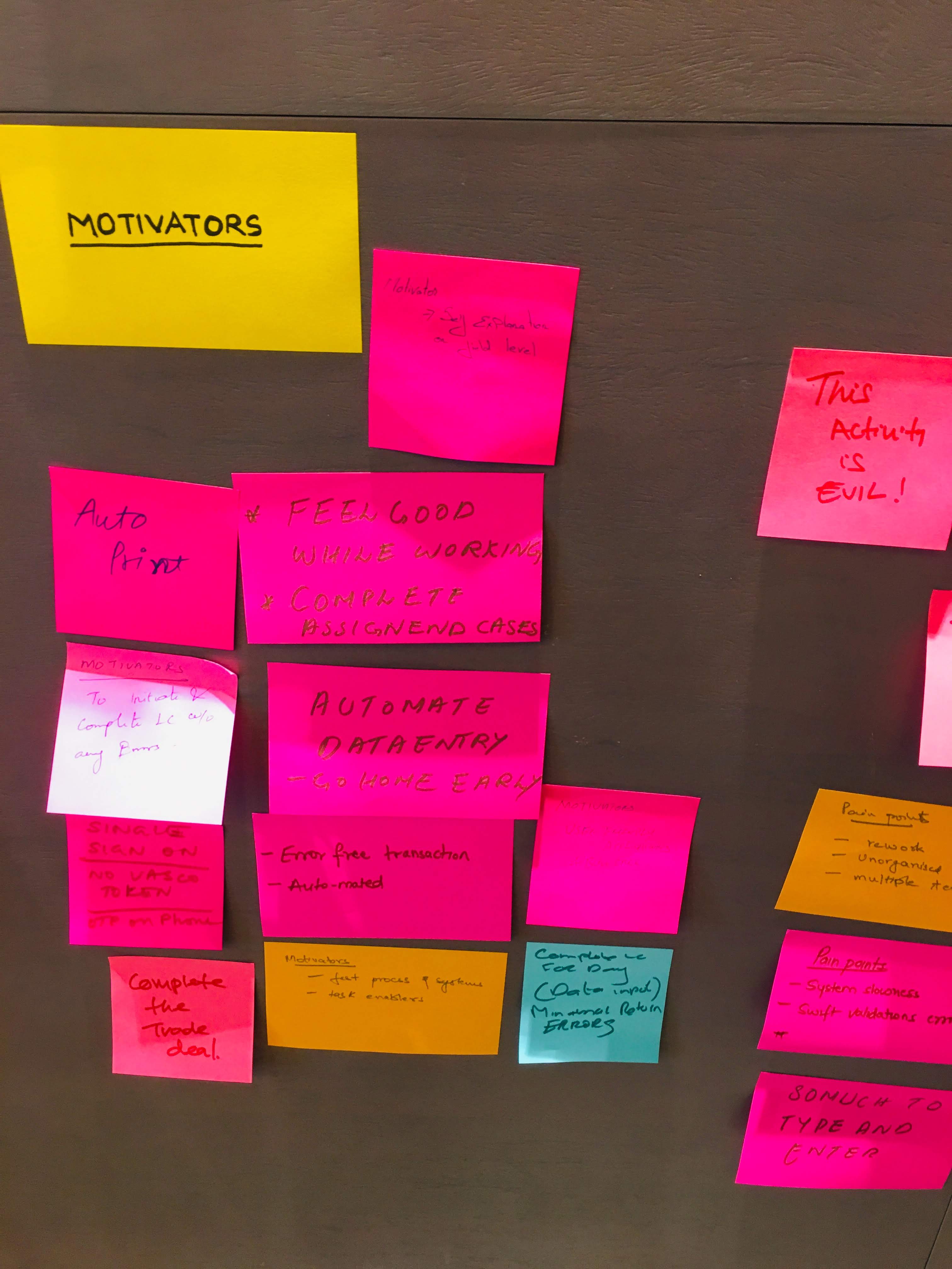
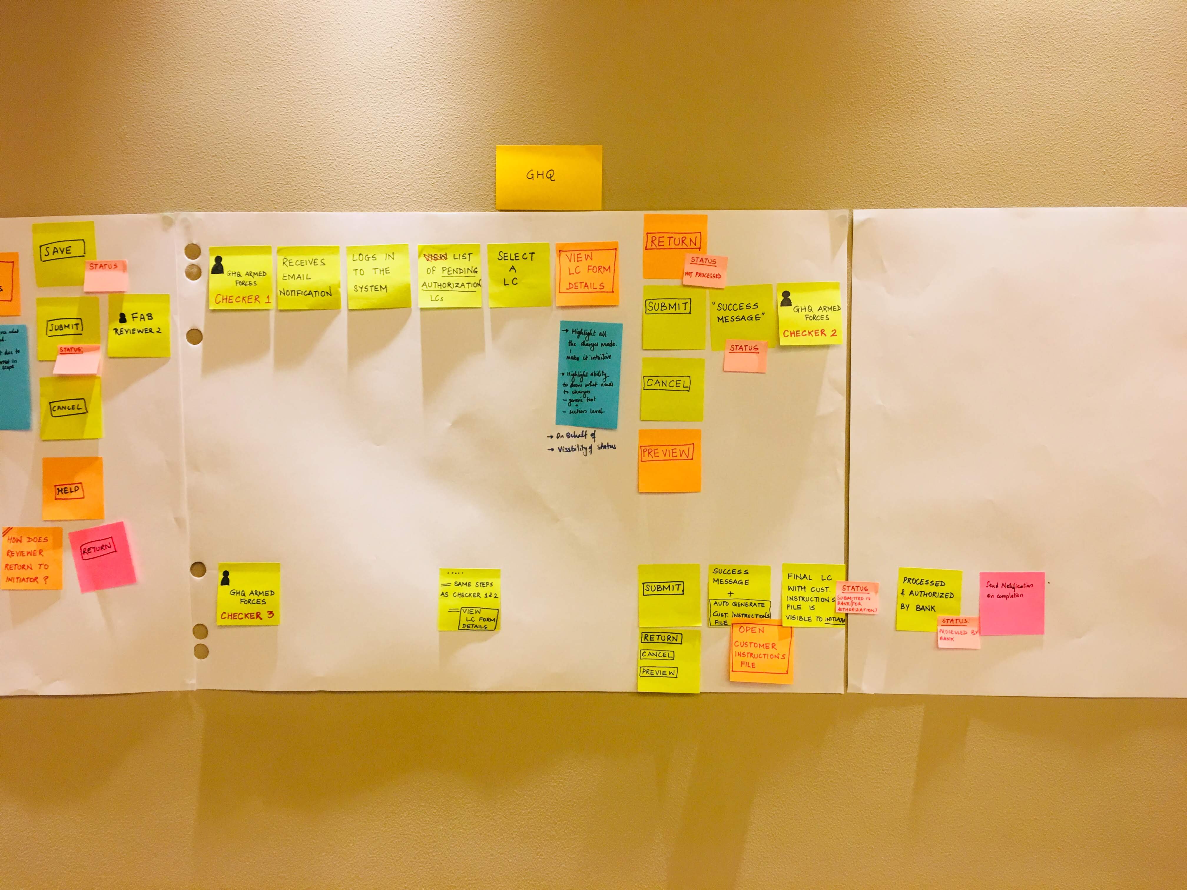
Client workshop session with FAB stakeholders. 
A snapshot from the Deloitte journey.