Case study · 2020 – Present
Oracle — designing operator-grade consoles for AI-assisted database work.
Principal UX Designer on OCI Database-as-a-Service. The user sitting on the other side of these screens lives in this tool.
- Period
- Feb 2020 – Present
- Role
- Principal UX Designer
- Tags
- EnterpriseCloud DatabaseAI orchestrationDesign system
I joined the OCI Database-as-a-Service org in 2020. The work is around the Database console — the surface database administrators and fleet operators use to run their day. The user sitting on the other side of these screens isn't a casual visitor; they're someone who lives in this tool.
That changes the UX problem in interesting ways. Density beats whitespace. A click saved compounds across thousands of operations. The interface has to disappear so the work can show. Most of what I think about, day to day, is how to make a tool an operator already knows feel like it's quietly getting out of the way.
Most artifacts are under NDA. Sanitized walkthroughs are available on request — and what follows is what I can share publicly.
Role
Principal UX Designer on the DBaaS team.
- 01UX work across several DBaaS services, partnering with PMs and engineering to frame the right problem before drawing screens.
- 02Designing the human-in-the-loop layer for AI-assisted database operations — confidence-state UX, permission handshakes, and audit-trail interfaces for autonomous agents acting on production state.
- 03Contributing to and reusing patterns from Oracle's HgDS and RDS design systems — especially where console-admin use cases (dense tables, long-running jobs, fleet operations) need things the defaults don't quite cover.
- 04Sitting in on cross-team design reviews to keep flows consistent and accessible across services.
- 05Mentoring designers and helping codify how the team goes from research → flows → handoff.
- 06Helping shape internal critique and review cadence so feedback is structured, not ad-hoc.
- 07In parallel — publishing open-source code prototypes (Helm, Sentinel, Recourse) and the Probabilistic-UI pattern library as a way to mentor the field publicly and explore the same agentic-UX design moves in adjacent contexts.
Designing for cloud console OCI Database Admin journeys has taught me to solve for complex systems outside just the digital space.
Selected projects
A few of the DBaaS surfaces I've worked on. Each one is a different kind of UX problem — but the through-line is the same: study how the operator actually works, then design the console around their job, not around the database's data model.
01
AI-assisted database operations
Designing the human-in-the-loop layer for AI agents that act on production database state.
AI-assisted database operations
Designing the human-in-the-loop layer for AI agents that act on production database state.
Context
Oracle's database services have been getting AI features — query authoring, code generation, autonomous agents that modify state. The design problem isn't "add a chat box." It's how a DBA stays in control while the AI is acting on production systems where mistakes are extraordinarily expensive.
UX angle
Three different problem classes hiding inside one feature ask: making model uncertainty legible, making permission asks honest, and making background-agent actions auditable. Each one needed its own primitive.
Approach
Confidence-state UX with calibrated bands gating between auto-execute, review-and-edit, and constraint-elicitation. Permission handshakes that are silent for read paths and multi-factor with a diff view for production schema changes — friction-as-a-feature on irreversible writes. Audit-trail interfaces that sync CLI and background-agent actions to a visual log with undo, verify, and intervene affordances. Confidence-score-bound highlighting on AI-generated PL/SQL so reviewers verify-and-edit instead of accept-or-reject.
What I learned
For AI in operator-grade tools, the design's job is to make the model's uncertainty visible — not to hide it behind confidence theater. Reversibility (recovery cost), not safety, is the right policy axis. The same primitives I've documented in the open-source Probabilistic-UI pattern library carry across all three problem classes.
02
GoldenGate Veridata
Bringing a legacy data-comparison console onto the RDS design system.
GoldenGate Veridata
Bringing a legacy data-comparison console onto the RDS design system.
Context
GoldenGate Veridata is the tool DBAs use to compare and reconcile data between source and target databases during replication. The console had been carrying years of accumulated IA — admins were doing four jobs (configure, run, monitor, repair) inside one undifferentiated surface.
UX angle
The interesting question wasn't "how do we modernise the look" — it was "what is the admin actually trying to do, and is the IA shaped around it?" Reframing the problem as four distinct jobs changed everything that came after.
Approach
Re-anchored the IA around the four jobs instead of the legacy menu. Pressure-tested every flow against the user under incident conditions, not the one running a clean demo. Cleaned the visual language up to RDS while keeping the dense-table affordances admins actually rely on.
What I learned
For an operator-grade tool, density isn't a problem to solve — it's a feature to design around. Stripping it for the sake of "clean" is a beginner move.
03Autonomous Database Services (OCI)
A prioritised pattern for surfacing applicable promotions across the DB admin journey.
Autonomous Database Services (OCI)
A prioritised pattern for surfacing applicable promotions across the DB admin journey.
Context
Autonomous Database has multiple promotional offers running at any time — different SKUs, regions, customer tiers. The console was either showing all of them (overwhelming) or none (revenue left on the table). Admins kept missing things they were eligible for.
UX angle
A "promotion" isn't a UI element. It's a small system with eligibility, priority, dismissal state, repetition rules. Once you treat it that way, the design follows; treat it as a banner and you fight the same problem on every page.
Approach
Designed a priority + dismissal model so a high-impact offer outranks a low-impact one, and the same offer doesn't shout at the same admin five screens in a row. Reusable pattern, not per-page custom work.
What I learned
The hardest UX problems hide as "just a banner." Recognising when a small interface element is actually a system is half the job.
04
Spatial Studio
Making spatial / market analysis usable for non-spatial analysts.
Spatial Studio
Making spatial / market analysis usable for non-spatial analysts.
Context
Spatial Studio sits between the database and analysts who want to ask geographic questions of their data. The catch: most users aren't trained spatial analysts. They're business users with a map and a question.
UX angle
The user we were designing for wasn't the spec's user. The spec assumed a trained spatial analyst; the actual user was a business analyst with a question and a map. Designing for that gap is most of the work.
Approach
Simple defaults that produce a useful map in one click. Deeper spatial controls hidden behind progressive disclosure for the moment a user is ready for them. Familiar shell so anyone moving between DB tools doesn't relearn the console.
What I learned
Design for the user who'd never have asked for the tool. The expert can find the depth; the curious user is who you lose if the on-ramp is wrong.
05
Graph Studio
A graph-analytics surface for users who don't speak Cypher.
Graph Studio
A graph-analytics surface for users who don't speak Cypher.
Context
Graph Studio gives analysts a way to explore graph data — relationships, paths, communities — without writing graph query languages by hand. The previous version asked too much technical fluency from the user.
UX angle
The hard part isn't the visual canvas. It's choosing the right abstraction layer between "click and explore" and "write your own Cypher" — and making sure neither user feels punished for landing where they did.
Approach
Visual canvas with progressive depth. A curious analyst gets value in one click; an advanced user can drop into the underlying query whenever they want. Same shell as the rest of the DB tools, so the console feels like one product across services.
What I learned
The right abstraction is the one that gives value at the shallow end and never traps you at the deep end. Most failed analytics tools fail one of those two tests.
What designing for operators has taught me
- LESSON 01
Density beats whitespace when the user lives in the tool.
Consumer-grade airy layouts cost operators time. Information density with clear hierarchy is the move — and the hardest sell to anyone trained on consumer UX defaults.
- LESSON 02
Most console inconsistency is two teams solving the same problem in isolation.
A lot of UX work is conversation work — making sure the same pattern shows up in two places because we agreed on it, not because we both happened to land there.
- LESSON 03
A pattern earns its place by being reused.
Adoption is a better signal than approval. If a pattern isn't being picked up by the next team, it probably wasn't the right pattern.
- LESSON 04
Pressure-test against the tired user.
Polished demos lie. The truth shows up when someone is recovering a database at the end of a long day — that user is the one to design for.
Read more here.
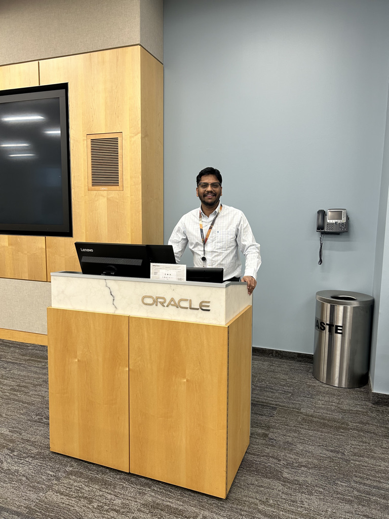
Moments
Snapshots from the Oracle journey — remote collaboration, product context, and team memory.
Remote collaboration setup while working with Oracle teams. Product context from Oracle Cloud Infrastructure workstreams. 
A visual memory from the Oracle journey.